The Moodboard Before the Moodboard
“Good design starts with emotion.”
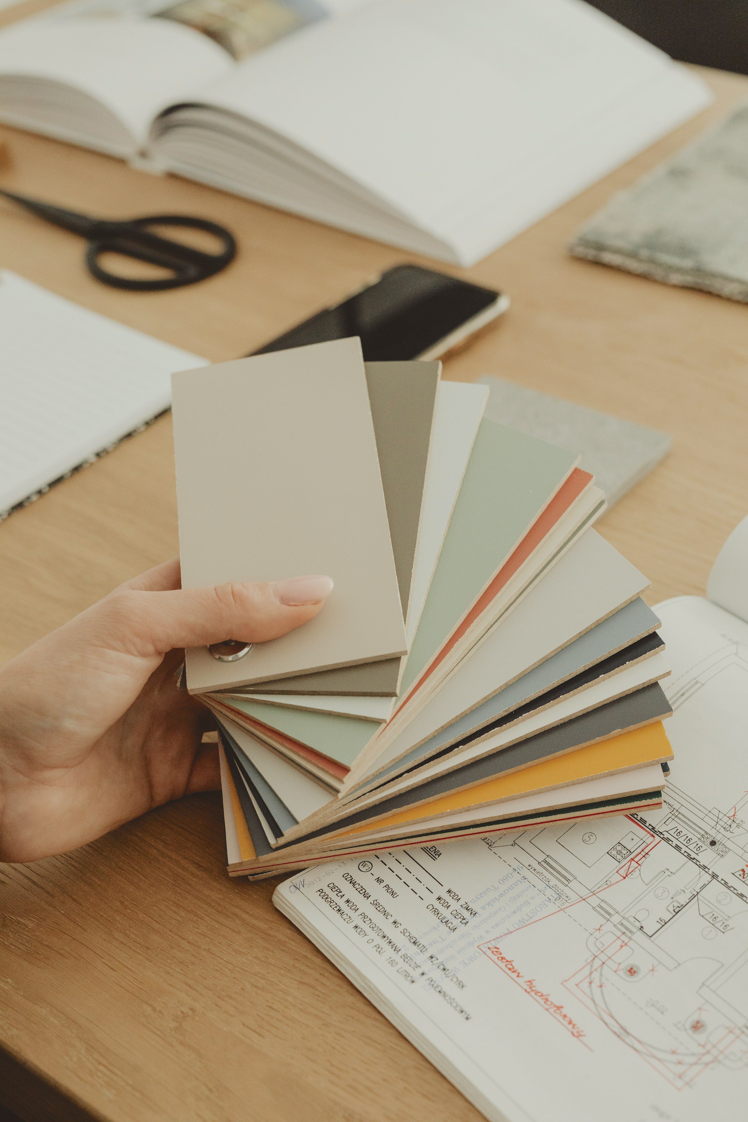
There’s always that early stage in a new project when everyone is eager to see visuals. Logos, typefaces, colours, layouts. Someone says, “Let’s start building the moodboard,” and the room comes alive with screens, links and Pinterest boards. It’s exciting. But for me, that’s never the real beginning.
Long before I touch Adobe or Figma, or save a single image, there’s a quieter process that happens in my mind. I start collecting impressions. Not references. Feelings. The way the brand should make someone feel the first time they see it, or the kind of calm a product should bring when someone uses it.
I call that space the moodboard before the moodboard.
The Real Beginning
Think about it. We all swim in the same sea of inspiration — Behance, Dribbble, Pinterest. So we all end up building versions of the same thing.
When I’m trying to understand what a brand should feel like, I write down words instead. When I worked on the Neo° identity, my first words were “care,” “intelligent” and “human.” The goal wasn’t to look like a tech company. It was to make doctors, patients and families feel reassured.
That early emotional clarity became our north star. Every design choice that followed, from typography and spacing to the tone of the copy, had to express those same feelings. Skip this step and jump straight into visuals, and your brand might look polished but feel hollow. A beautiful room with no air.
So my rule is simple: collect feelings, not fonts. You can always google colour ideas later. You can’t google lived experience.
“Every good brand starts long before the visuals. The real work is emotional translation — learning to sense what a brand should feel like before you ever design it.”
Collecting Clues From Real Life
Fresh inspiration rarely comes from other designers. It comes from small, overlooked things. Plants. Architecture. The way people treat each other.
Those things are hard to explain, but they matter. They tell you what a brand should feel like before you’ve designed anything. So before visuals, I look for moments like that — small truths that reveal what people actually care about.
Translating Emotion Into Design Logic
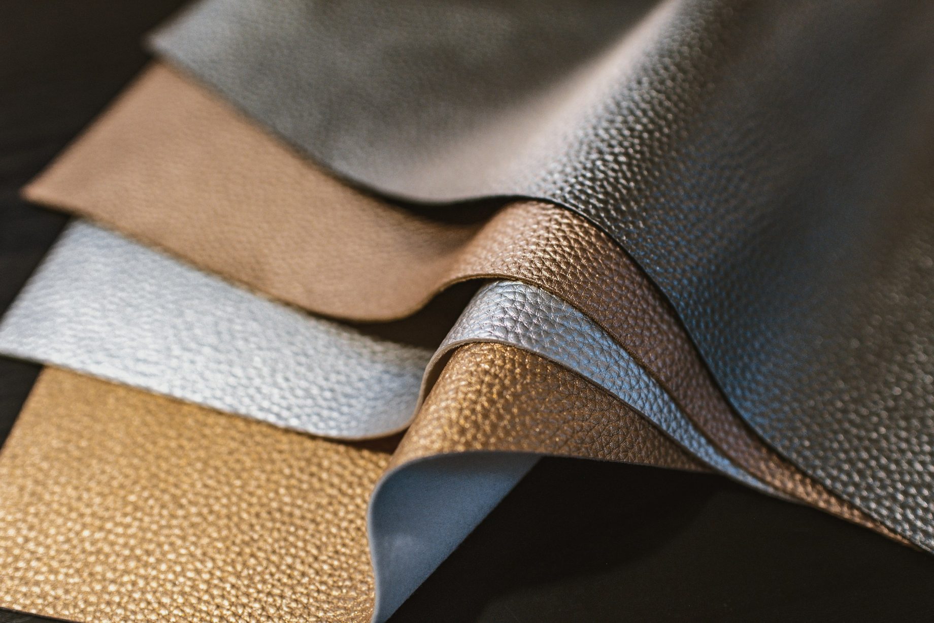
Once I’ve collected enough emotion, I move to visuals. This is where the moodboard we all know happens: images, textures, references.
But because I’ve already named the emotions, the visual process becomes focused. I’m not scrolling endlessly looking for what’s “cool.” I’m choosing visuals that feel like the words I wrote earlier. It cuts the hunting time in half.
The Confidence Stage
We feel stuck because we design too fast. We rush from brief to board, trying to impress with visuals instead of understanding the heartbeat of what we’re creating.
Slow down and build the invisible moodboard first — sit with the emotion, the story, the lived experience of the brand — and the work suddenly has depth. You’ll notice something else too. Clients start trusting you more, because what you present isn’t arbitrary. It has reasoning, language and emotional intelligence behind it.
That early work becomes a map. Every designer and writer who joins the team later understands what the brand is supposed to feel like. That alignment is what creates consistency.
I see designers chase “premium” all the time. But premium is just what happens when something feels intentional. When every element feels like it belongs, people call it premium. That kind of intention doesn’t come from copying what’s trending. It comes from knowing which emotion you’re trying to hold.
A Note to Fellow Designers
The next time you start a project, pause before you open Pinterest. Ask yourself what this brand wants people to feel. Write three words.
Then look for those feelings in real life — in textures, spaces, people, sounds, habits. Start from emotion and everything after becomes easier, faster and far more meaningful.
What would your three words be for the project on your desk right now?