Traction
When Traction came to me, they were at an interesting inflection point. They'd spent three years building a platform that was revolutionizing how small businesses in Nigeria handle their finances, but their brand wasn't keeping up with their ambitions. You know that moment when you look in the mirror and realize you've outgrown your teenage clothes? That was Traction with their brand.
The Identity Crisis
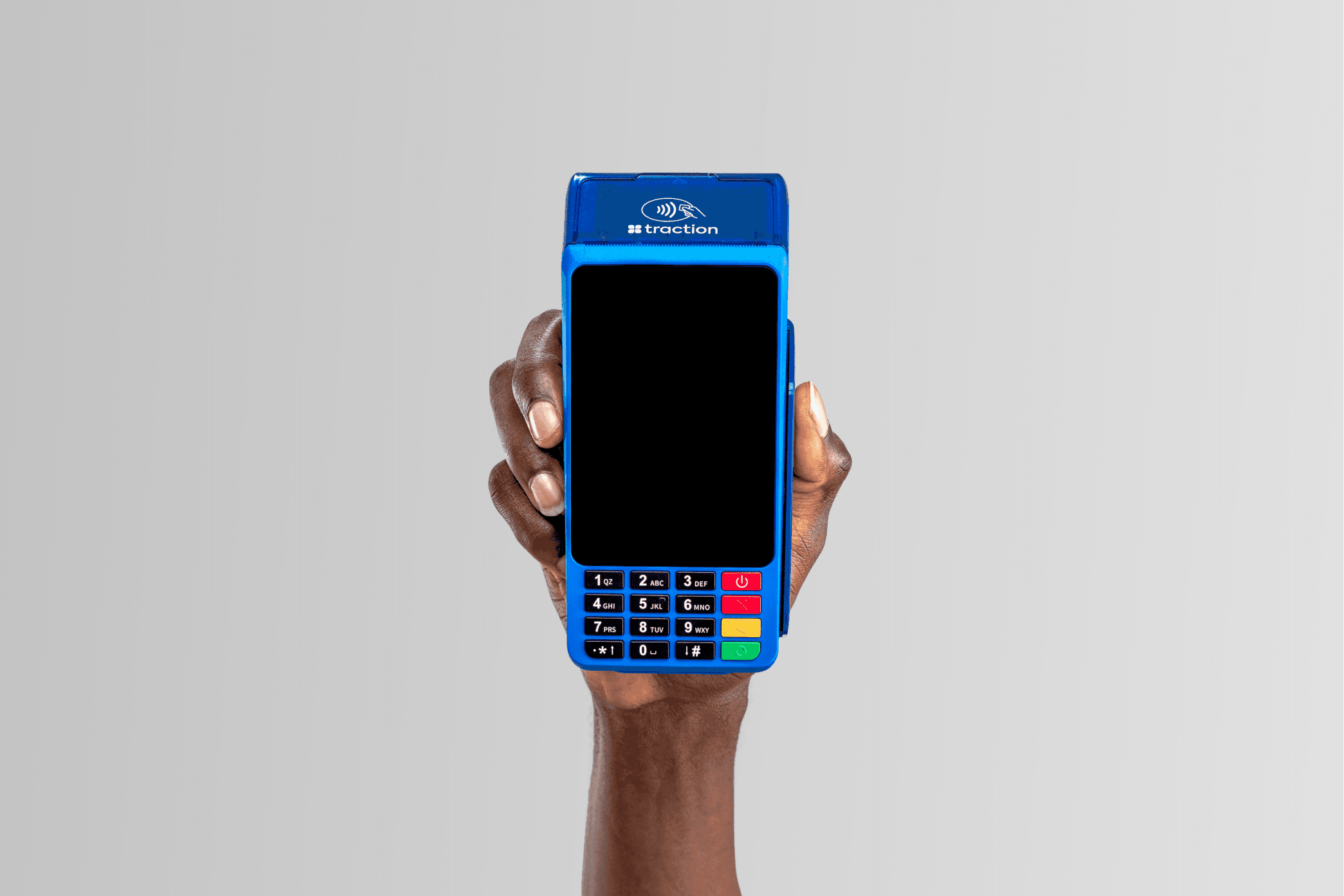
The first red flag? Their logo was basically a twin of a major tech corporation's icon. Not exactly the unique identity you want when you're trying to be the go-to financial partner for Africa's SMEs. But hey, we've all been there – sometimes you need to walk before you can run. Here's where it gets interesting. When we started digging into how Traction's own employees viewed the brand, we discovered something fascinating: ask ten different team members what Traction was, and you'd get ten different answers. It was like a corporate version of the blind men and the elephant. Plus, there were more versions of their logo floating around than there are Nigerian jollof recipes (okay, maybe not that many, but you get the idea).
The Butterfly Effect
The first thing we tackled was the name. "Traction Apps" made them sound like a software company, when in reality they were building nothing less than the growth operating system for African SMEs. So we stripped it down to just "Traction" – simple, powerful, and most importantly, scalable. Remember those four squares in their old logo? We saw something there that nobody else had noticed. With some careful tweaking – rounding the corners just so, adjusting the angles carefully – those squares transformed into something entirely new: a butterfly. It wasn't just about making something pretty; this was about telling Traction's story of transformation and growth. Every small business they help is going through its own metamorphosis, after all.
The New Identity
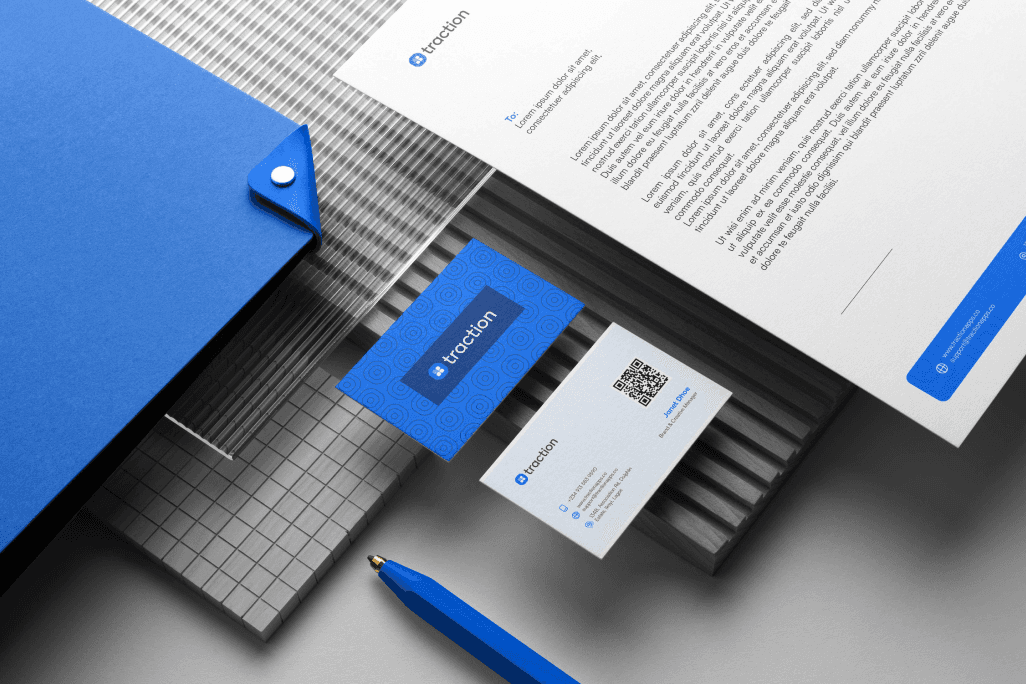
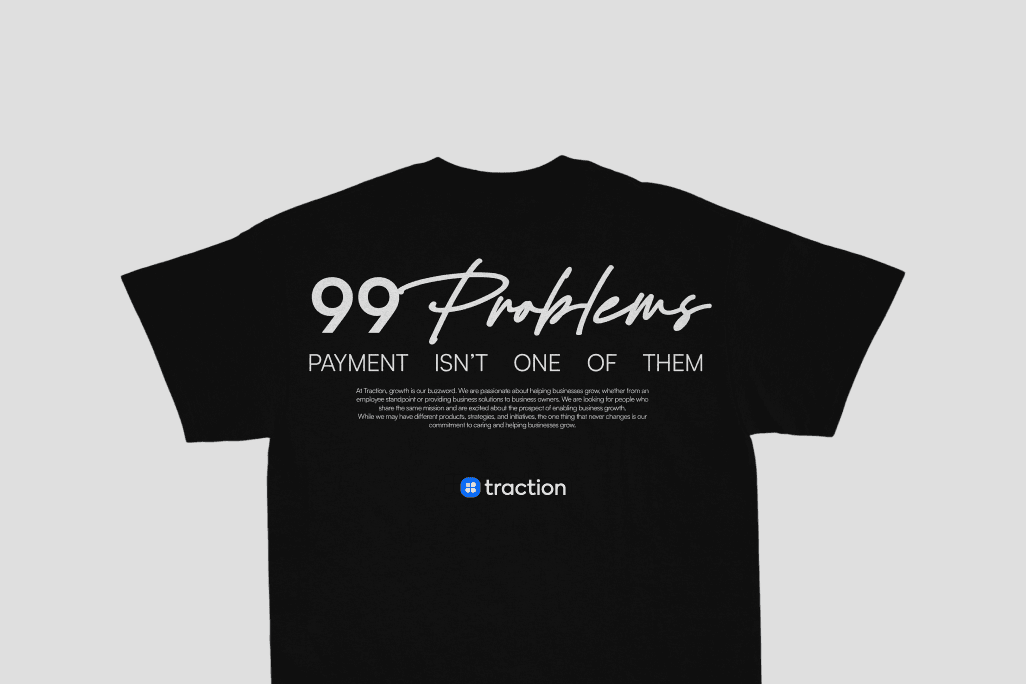
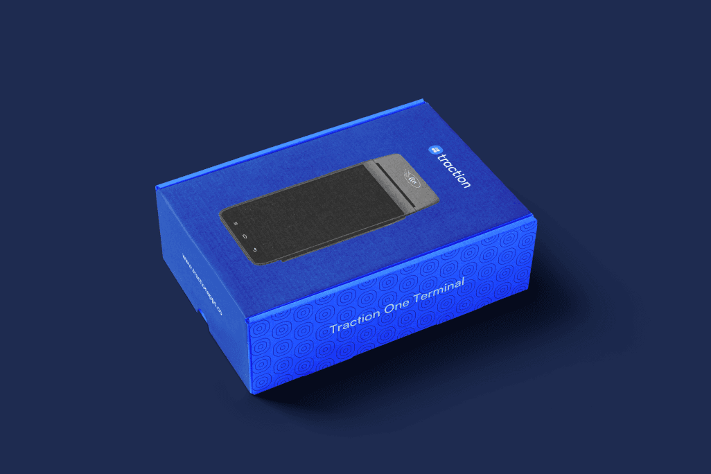
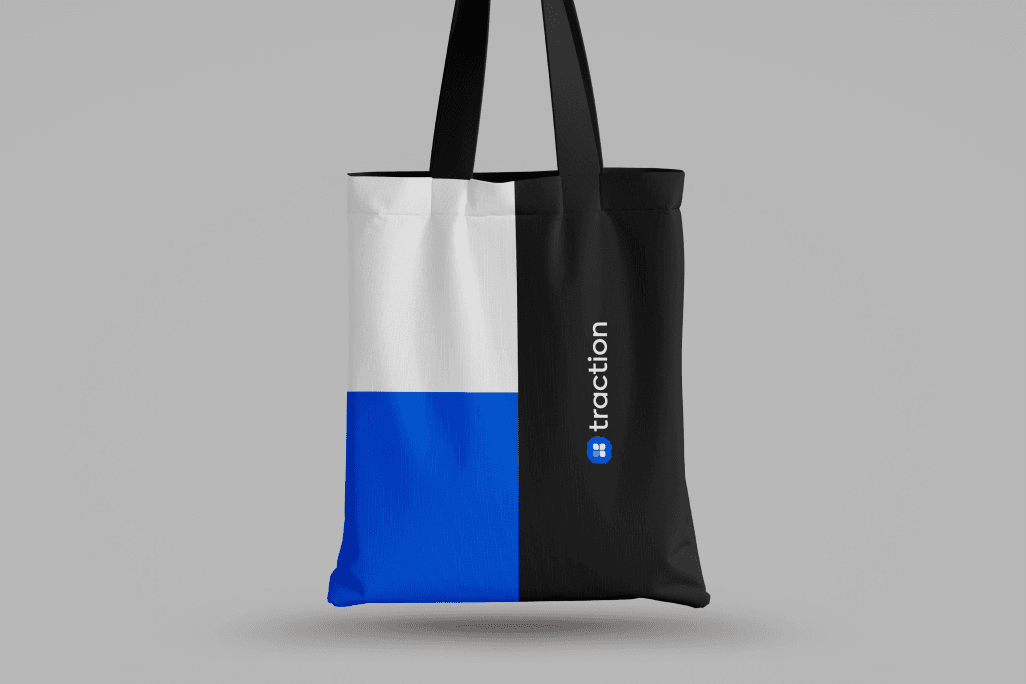
The old blue was... well, let's just say it was enthusiastic. Very enthusiastic. We toned it down to what we called "Epic Blue" – professional enough for a financial company but friendly enough for the small business owner who's just starting out. We swapped the previous yellow for green, partly because competitors were heavy on the yellow, but mostly because green speaks to growth and prosperity – exactly what Traction helps their clients achieve. After months of testing (yes, months – good type is worth the wait), we landed on Satoshi and Axiforma. These weren't just pretty fonts; they were workhorses that could handle everything from mobile apps to billboards. We went with lowercase for the logo – because sometimes the power move is to be approachable rather than imposing. Here's where things got really interesting. Instead of the usual "here's your logo, good luck" handoff, we developed an 8-week launch strategy. We created a team of "Brand Champions" within the company – think of them as brand DJs, mixing and maintaining the right identity vibe across all departments. We even made sure the brand became part of employee onboarding. Because what's the point of a great brand if your own people don't know how to keep it alive?


Brand Motifs




The Result
Look, we could throw around some fancy metrics, but here's the truth: brands are marathons, not sprints. What we do know is that we took a company that was doing revolutionary work for African SMEs and gave them an identity that finally matched their ambitions. Their team can now confidently tell the world who they are and what they stand for. Most importantly, when small business owners across Nigeria see that butterfly logo, they don't see just another fintech company – they see a growth partner who gets them. And really, isn't that what great branding is all about?